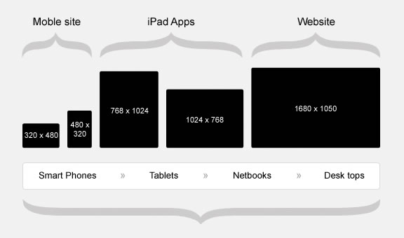
Responsive web design for companies is no longer a "nice to have". In 2016, your visitors, including real live humans and search engine bots, are viewing your website on various devices and screen resolutions. From desktop to laptop, tablet to smartphone, how do you provide an experience tailored to suit each interface? The answer: Responsive Design.
What is responsive web design?
Responsive website design is the practice of dynamically adjusting web page layouts and content based on screen resolution. The goal is to maximize usability/viewability across all devices and screen sizes while maintaining one single source for code and content – one website that looks and functions great on all devices at all sizes.
Why is responsive web design important for my company?
Of all the web design mistakes a company can potentially make, having a non-responsive site can easily be one of the most costly. Here are 3 of the main reasons why responsive web design matters to you:
1) Single Source
A mobile responsive website is a single website with one set of code and one set of content that works for all devices and screen sizes. This streamlines the delivery of updates and maintenance of the code and content as compared to a traditional mobile site that exists independent of your main website. A mobile responsive site will be more cost-effective and result in a more consistent user experience when viewed on different devices.
2) User Experience
All sites built with mobile friendly coding practices, whether they are responsive or not, will function on your mobile devices as they do on your desktop or laptop. The problem is that the limitations created by screen size and the touch interface can make these sites difficult to use. Navigation menus may be too small to touch accurately, text may require zooming to read, and images may be too small to adequately support the content. When we transition to a responsive design, we address these limitations by creating a touch friendly navigation, adjusting text-sizes, margins and padding for improved readability, and adjusting layout to display content that is easily viewed and scrolled in a single direction.

As the gap continues to widen between the smallest and largest display resolutions, your website’s ability to adjust its content and functionality to meet the user’s needs at any size becomes paramount.
3) Search Engine Optimization
As search engines continue to see an increasing number of their searches coming from mobile devices, they want to promote search results that are going to look and function well on those devices. Beginning in the spring of 2015, Google began rewarding websites that were built to be mobile responsive, effectively penalizing websites that were not. If you are concerned about your search engine rankings, then transitioning to a mobile responsive design is an absolute necessity.
So responsive web design IS important. How do I get started? Do I need a new website?!
This depends entirely on how your website was built. In many cases it's possible to retrofit a mobile responsive web design onto your company's existing website. This is likely the case if your company's current website is built on a content management system (CMS) like Wordpress or Drupal. In any case, it is a good opportunity to discuss and evaluate your content as it relates to changes in screen resolution, device, and search engine performance.
As a responsive web design company, Snyder Group's approach is to first do a complete assessment of your current website. This initial review is done at no cost to you and will uncover any potential opportunities to improve your website. From there, using CSS3 media queries, we create content rules and styles that are dependent on the user’s screen resolution. When the site is viewed at 1920x1080 pixels on your desktop, we use one set of rules, when viewed at 375x667 pixels on your phone, we apply a different set of rules that will adjust the layout, navigation, fonts, etc. to improve the user experience on the smaller display.
This process will usually involve no down-time for your current website and will instantly improve your visibility on search engines. If you would like to learn more or have our team assess your current website, then please connect with us below. A Marketing Strategy Assessment only takes about 45 minutes and includes a review of your website optimization opportunities.
