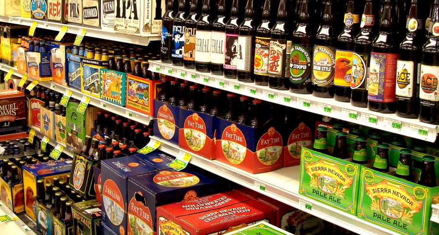
You know that famous phrase "A picture is worth a thousand words"? Here is my take on it: "A beer is worth a thousand words". It's not just that refreshing taste on a hot summer day that we all love so much, but it's the way it looks that draws us in as well. A simple beer bottle or can says a lot about the person drinking it. "Beer brands are brands that you wear. They make a statement about who you are," says Tom Long, MillerCoors CEO.

It's been said that the number of craft brewery operations in the U.S has increased from less than 100 to more than 2,500 over the past few years. As the beer industry continues to evolve, so do its brands. Brewing companies are spending millions on rebranding their logos and packaging to keep up in this competitive industry.
Breweries such as Ballast Point, Summit, and Redhook are overhauling their look and feel, but still keeping the historic elements that people have embraced over the years. Some of these brewing companies are 10 to 20 years old, but their packaging reflects otherwise. The trend now is what's old is new. This seems to be the fundamental design strategy for most of the upstart breweries.
Rebranding is never a simple task, but a fun one for those passionate designers who create these stylish, innovative, well-crafted masterpieces. Designers spends hours upon hours researching and coming up with just the right concept that fits the beer's heritage and buyer perosona because beer brands can represent so much.
Here are a few example of breweries that have updated there brand and packaging:
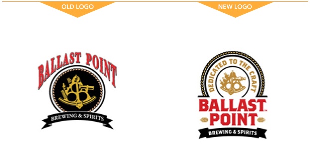
BALLAST POINT BREWING & SPIRITS (SAN DIEGO, CA)
The Logo Change
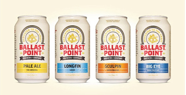
New Can Packaging
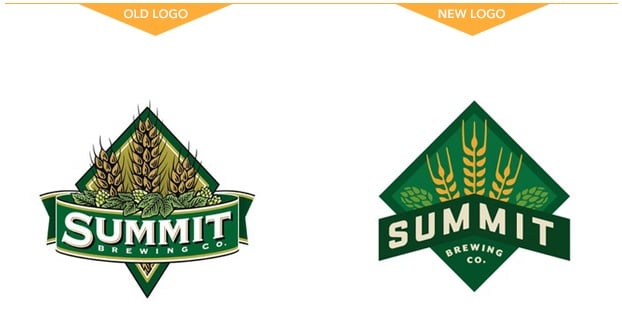
SUMMIT BREWING NEW LOGO
The Logo Change
CAPTAIN LAWRENCE REBRAND
The Logo Change

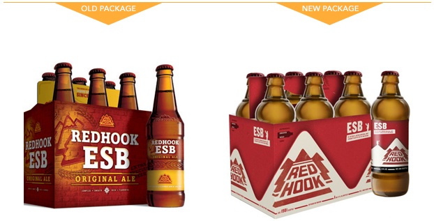
REDHOOK BEER REBRANDS PACKAGING
New Bottle Packaging
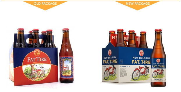
NEW BELGIUM REBRAND
New Bottle Packaging
