City and town government websites are important hubs. You’ve probably logged onto your own in the past year. They allow residents to find information such as what day is garbage pickup or where to pay a parking ticket. They provide residents and businesses a way to learn about public meetings or to download needed forms. Visitors can see what’s happening in the city or how to get around.
So we’re taking a look at the essentials for a city or municipal website by pointing out some of our favorites that provide people an engaging experience through smart design, organization and functionality.
Who’s The Boss
First and foremost, it’s critical the site has user-first design and functionality. This may seem like a no brainer, but used to be (and in many cases still is) city websites were largely led by IT folks who focused on the back end, not the design or user experience. Those of us who have a marketing brain, know that you need to start from the point of view of your audience – in this case primarily city residents, businesses and visitors.
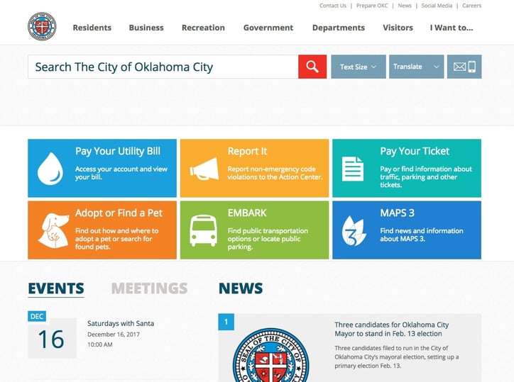
Oklahoma City’s site is a good example of catering to the user. Top navs are separated by audience. The home page has the most pertinent things on top as large tabs: pay utility bill, report non-emergency code violations, or pay parking ticket. Also upfront and center are a search box, adjustable font size functionality, and translation options.
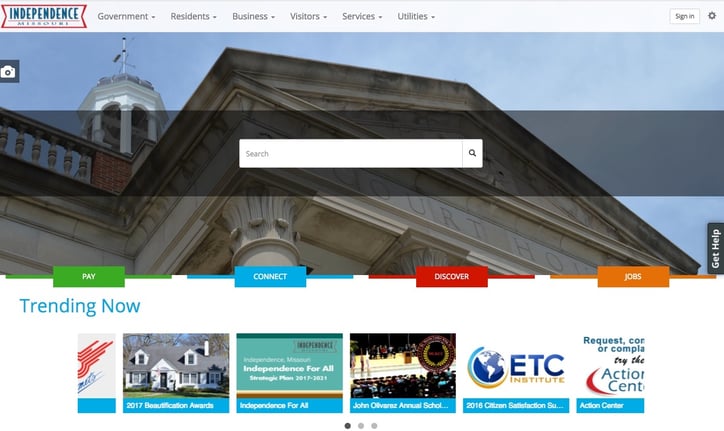
Independence, Missouri has a few nice features that are designed to help users. A "trending now" bar that highlights popular city resources right on the front page. The site also has a “Get Help” tab on side of every page that allows you to take quick action to find a service by category or search. We also love the City Stat widget that highlights miscellaneous facts about the city’s online services such as “3,138 people paid their utilities bill online last week”.
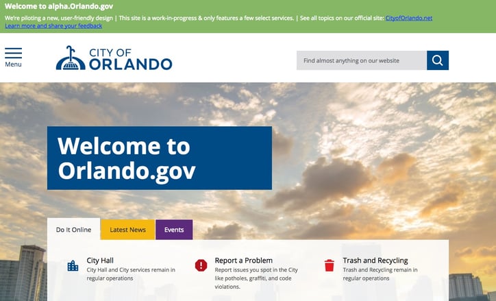
So, if you’re a municipality, as you design or redesign your site, look at your current analytics. How are people using the site? Are they looking to pay fines, get information on local events, or seeking a government job? Some cities take steps to engage the public to get their feedback as they go through the design process. This is exactly what Orlando is doing right now. Check out the alpha site they’re testing where residents can give feedback on the new design and structure.
Offer Functionality
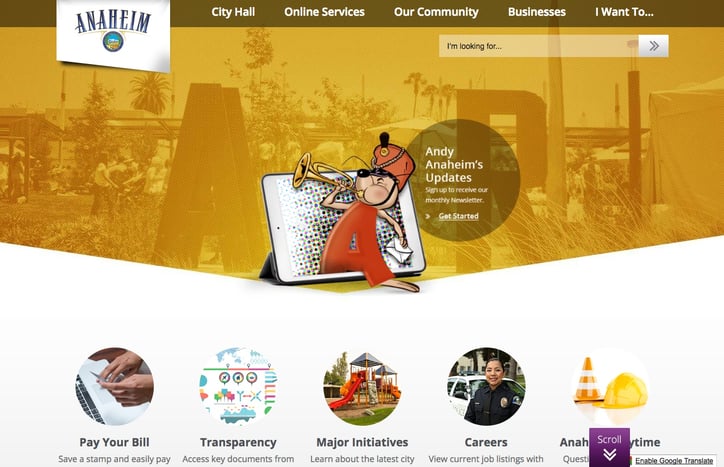
With user-first in mind, it goes without saying that the sites mentioned above allow you to get things done online. City government websites can no longer be a one-way communication where public officials push their information out to people. People are now accustomed to finding and paying for all number of things – most anything actually – online. Don’t make people feel as if they have to schlep to city hall to do their business. Anaheim, California has a multitude of things you can pay for and transact online. In fact, one of their top navigation buttons is online services and a big callout up top for “pay your bill” where you can pay for utilities, permits, parking tickets or library fines.
Make It Easy
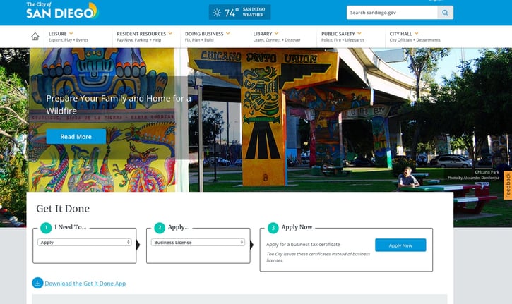
Just like you, when they’re looking to do something online, city residents don’t want to go down layers to find what they need. They want self-service, and they want it quickly. We’ve noticed good city websites have a search bar prominently featured. We like San Diego’s “Get It Done” feature for searching.
Keep It Simple
In keeping with allowing the user to find things easily, the best city sites use simple, high-image, low-text designs. Time was when government sites had text-heavy designs where people had to navigate through a confusing amount of information to find the information s or service they were looking for. Don’t try to cram everything into one view. Fresh, modern and aesthetically pleasing design will allow residents and citizens to find what they are looking for and keep them on the site longer and coming back. This may take a little more thought to how the site is organized, but will pay off in the long run.
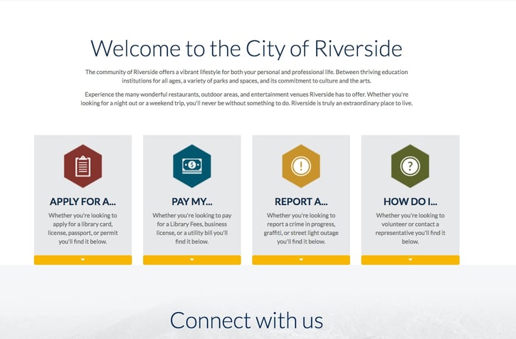
All of the previous sites do this. Riverside, California, too, has a nice layout with upcoming events, large buttons with links to most pertinent services and social media accessibility.
Be Accessible
This may sound obvious, but we’ll mention it anyway because it needs to be stated. City websites, as all sites these days, need to be mobile responsive so citizens can use any device with same seamless experience. There is a difference between making information available and making it accessible from wherever people are and on whatever device they’re using.
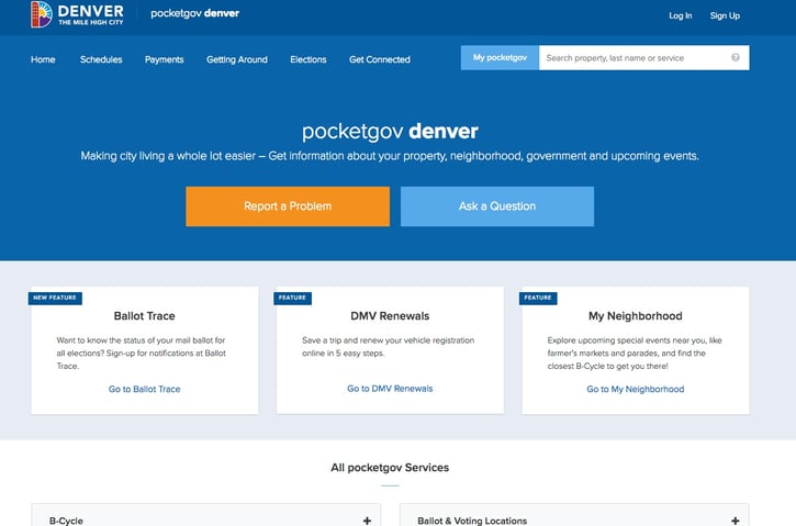
Denver’s Pocketgov portal and app allows users to access personalized local notifications to nearly 70 city services such as garbage pickup schedule.
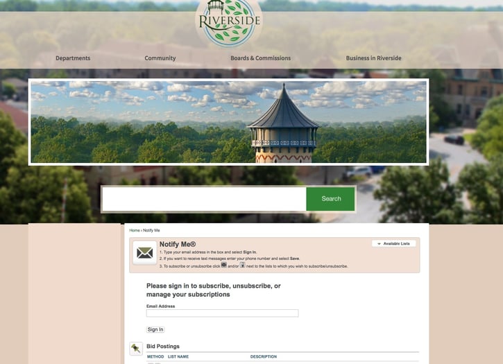
The website for Riverside, Illinois, while also being clean and easy to use, has a really cool Riverside Responds app, as well as a notify me function where you can sign up to get emails or texts for various things such as open government jobs, city news, parks and rec programs or events.
Get Social!
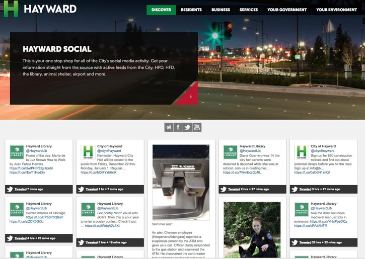
Most government entities, like businesses, need to have a strong social media presence to keep their constituents up to date. Hayward, California sees its site as a means to get people into services as well as a way to engage users in social media. It’s portal, “Hayward Social” is a “one stop shop” for all the City’s social media activity.
Stay Relevant
With all the great functionality and ease of use that your new website will have, there’s one crucial last consideration: making sure your information is fresh. No one wants to see empty or outdated news areas, calendars, or social media accounts. This is a surefire way to ensure your residents and businesses don’t come back to your site.
With more people expecting access to information and services on demand, city websites are becoming essential tools for working, living and playing in a city. Many of the website above have won accolades or awards. The key elements they all have in common are good, clean design, as well as providing an easy way to find things and do things online - a virtual city hall at your fingertips!

