Parking in an urban area can be a daunting task. The universal “P” signs are critical in helping drivers find parking. They can also be a good way for a parking agency or authority to extend its brand.
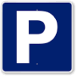
The “P” sign that everyone is familiar with is one of 50 symbols produced for public places, streets, airports and other transportation hubs, and at large international events through a collaboration between the American Institute of Graphic Arts, or AIGA, and the U.S. Department of Transportation beginning in 1974. Prior to this, individual symbols had been designed, but there was no system of signs that communicated the required range of complex messages, addressed people of different ages and cultures, and would be recognized and understood quickly and at a distance.
While some cities customize their parking signs, this can lead to inconsistency and confusion for drivers. See this memo on downtown city parking from the City of Plano, Texas on why they decided to use the universal “P” sign.
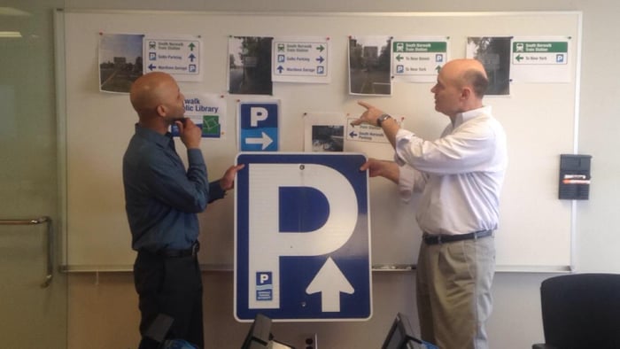
The Norwalk Parking Authority (NPA) in Norwalk, Connecticut with the help of Snyder Group, Inc. has successfully integrated the Authority’s branding into the “P” sign while maintaining the directional functionality of the sign. The NPA’s logo incorporates the “P” and also includes a definable wave graphic, a nod to the both the city’s maritime history and location on Long Island Sound.
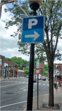
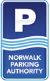
Using the universal “P", the P’s size was maximized from the NPA’s logo for easy visibility and readability.The wave was added, but altered in the new parking signs not to distract from the “P”. The new Norwalk Parking Authority parking sign is easily readable, understood by all, and supports the Authority’s brand.
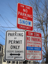
Now if only cities would make their parking regulation signs more understandable to people once they found that prized spot!
